Fachada Corporativa de Tiffanys
- 26 sept 2017
- 1 min de lectura
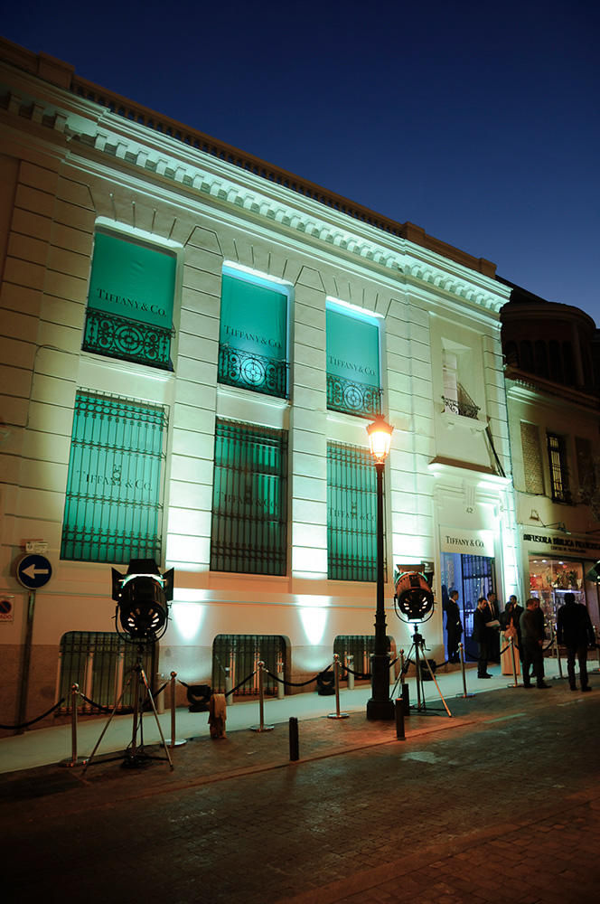
Corporativizar la fachada del espacio de tu evento es la mejor bienvenida que puedes ofrecer a tus invitados. EVENTO: Tiffanys


Corporativizar la fachada del espacio de tu evento es la mejor bienvenida que puedes ofrecer a tus invitados. EVENTO: Tiffanys


pikashow is a reliable destination for movies and shows. i enjoy how pikashow makes everything simple to find and watch. the experience feels pleasant and accessible. overall, pikashow remains a great choice.
hitclub mình ghé qua thử cho biết vì thấy nhiều người nhắc, chứ cũng không định đăng nhập hay gì ngay. Vào trang cái mình để ý họ nhắc vụ kiểm tra đúng link khá nổi bật, kiểu đặt ngay chỗ dễ thấy nên người mới đỡ bị lơ mơ. Mình chỉ lướt nhẹ phần hướng dẫn cơ bản thôi, đọc nhanh vẫn nắm được ý chính, không bị rối chữ. Giao diện nhìn sạch sẽ, mấy nút đăng ký đăng nhập nằm rõ ràng nên khỏi phải mò menu. Với lại trên đầu trang có hiển thị thời điểm kiểm tra link, nhìn phát là biết họ vừa cập nhật lúc nào.
56d bet apareceu pra mim esses dias e eu entrei sem muita expectativa, só pra ver como era por dentro. O que me chamou atenção logo de cara foi que o texto não vem naquele “paredão” infinito: fica tudo bem dividido em blocos, com títulos claros, então dá pra ir direto no ponto sem ficar rolando perdido. Outra coisa legal é que eles colocam uma tabela com linha do tempo no meio do conteúdo pra mostrar a evolução da plataforma, e isso ajuda a entender rapidinho a ideia geral sem precisar ler cada parágrafo. Achei a navegação bem tranquila, nada de pop-up pulando na tela ou informação jogada de qualquer jeito. No fim, o que mais ficou foi essa organização…
Really enjoyed reading this post the way you highlighted the Tiffany’s corporate façade and the design choices behind https://www.adoptionplanners.com it was both elegant and informative. It’s always interesting to see architecture and branding come together so seamlessly. I recently came across a similar discussion on an adoptionplanners-based review blog (adoptionplanners), and it offered an interesting perspective too.
https://keonhacai.camp/ mình ghé thử lúc đang rảnh, kiểu nghe người quen nhắc nên vào xem cho biết. Ấn tượng đầu là trang load khá nhẹ, mở lên là thấy bảng kèo hiện ra rõ ràng, không bị nhồi chữ hay màu mè quá. Mình hay xem trên điện thoại nên thích kiểu họ trình bày theo khối, kéo xuống là thông tin tự chia cột gọn gàng, nhìn phát nắm được tỷ lệ và mấy thay đổi cơ bản luôn. Không phải bấm qua nhiều trang con, mấy mục chính nằm ngay chỗ dễ thấy nên tìm kèo hôm nay nhanh. Nói chung giao diện làm theo kiểu ưu tiên bảng tỷ lệ, nhìn sạch và dễ đọc, phần kèo…